Wednesday 15 October 2014

my magic mic

This is the original mic that I started with then I out lined it and the next couple of pictures you will see are the copy's i made.


this is the first copy i made out of that picture above this is my black and white image i really like this one i tried it the other way and put the black where the white was and the white where the black was but it just didn't look right. I think the way i kept it worked out well it looks big and BOLD and it has unity thats the way i wanted it to look. 


this copy is probably my least favourite because its just plane boring and dark it kinda makes me depressed it has a good balance between the greys but thats probably the best thing about this. Im being serious when i say i really dislike the greyscale there is a lot of space in this image i didn't think it look that good in the centre of the  image overall i do not really like this one...did i mention that earlier 
This is my last image of my illustrator work and my favourite because i love the contrast of all the bright colours and how i used some of the same colours in different mic's. This is my favourite because i love the variety of mic's and the balance between the mic's my favourite mic on this image is the pink one with the yellow on the insides because it reminds me of the marilyn monroe painting with the pink back round and yellow hair. I emphisized the real looking mic because it looked real and it would make everyones eyes move around to the color and create movement  

i hope you enjoyed it

Thursday 9 October 2014

garden photos

 This photo is at the top because it is my favourite. Its my favourite because the selective focus on the main flower is beautiful and it emphasizes the main flower with the bee on it. I got this picture at the right time and place with the bee on the flower and all. I'm surprised i got that close i hate bee's.


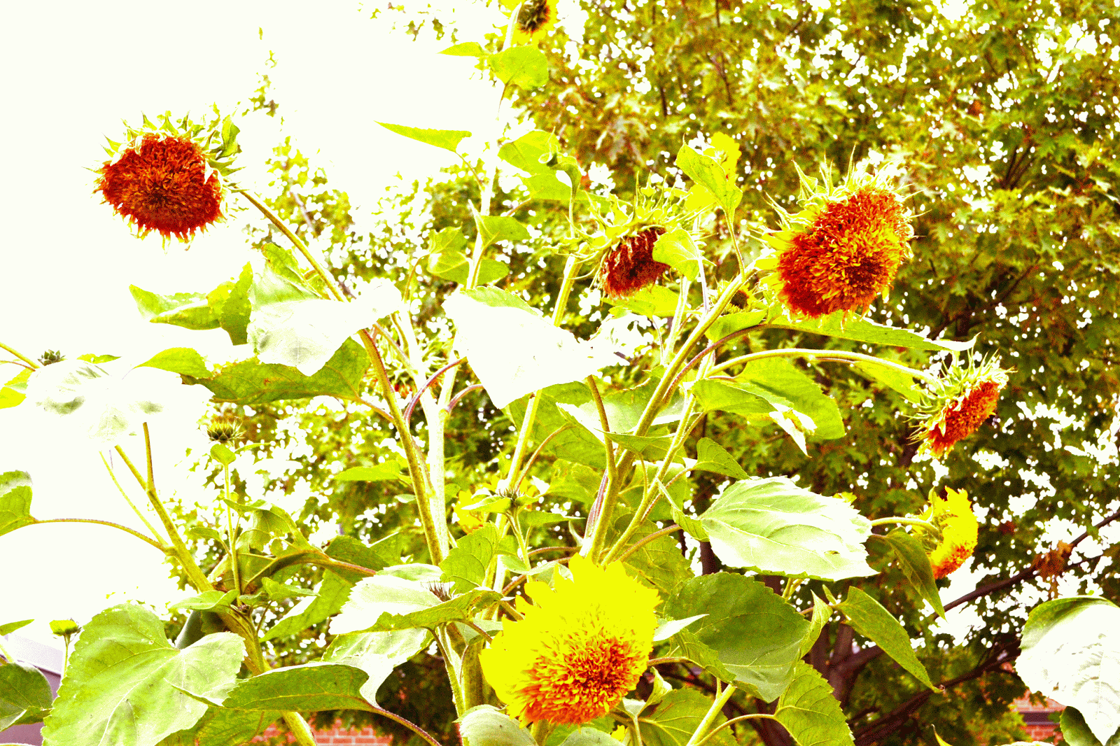
 I like this photo because the oranges pop and makes the flower look like its blooming i love the contrast in this image and i like how the dark green makes the orange pop and it emphasize's the bright colours. In the original the image was very plane and just empty thats why i wanted to make it fun looking with the bright oranges the orange never use to stand out and i wanted everyones eyes to go right to the orange. I also like the way the green looks and it looks like a jungle to me in a way.


I really like this photo because is simple i didn't change to much other then then the contrast and i crop'ed it because the whole image was to big and empty so i tried to just focus on the flowers. I also like it because it reminds me of a scene in one of my favourite shows the walking dead.


I like this picture because the way all the flowers are close together and it creates balance i kinda gave this image a vintage look in a way. This image doesn't have a whole lot to talk about this is probably my second least favourite.


Now this is my least favourite image because its just kinda boring my favourite part of this image is the bright colour and how it emphasizes it.